My Favourite Home Office Project of 2022

Interior design has a powerful ability to influence our frame of mind and motivation to work. As a result, beautifully styled and thoughtfully organised Home Offices can be an effective way to stimulate productivity.

As we approach a second National lockdown this week, those of us who saw the writing on the wall back in March have probably managed to update and improve their living spaces as much as possible. My clients number one request this year has been everything to do with a Home Office or to make an extra space more defined for purpose. I've heard everything from "build me one in the garden" (a post coming soon on that one!) to "please create a Home Office in my house so gorgeous that I will never want to leave it".
So I'm sharing one of my favourite Home Office projects which actually began in 2019 before any of us knew there was another Corona which wasn't a beer with a slice of lime in it!
My lovely clients, a husband and wife already had their own Home Office and it looked like this in the photo below.
Multi functional & easily adaptable spaces are key right now!
Aside from this room needing a heavy dose of Interior design love, it also needed to serve as a multi functional space , for work, relaxation and even sleep.
My clients wanted a place to work and maintain focus in but also a space to relax in with their children during downtime and also "guest room" to sleep in when their parents visit from abroad.
They both agreed they needed tons of concealed storage and they would continue to use their Gym , a room which only access was via this room, their home office.
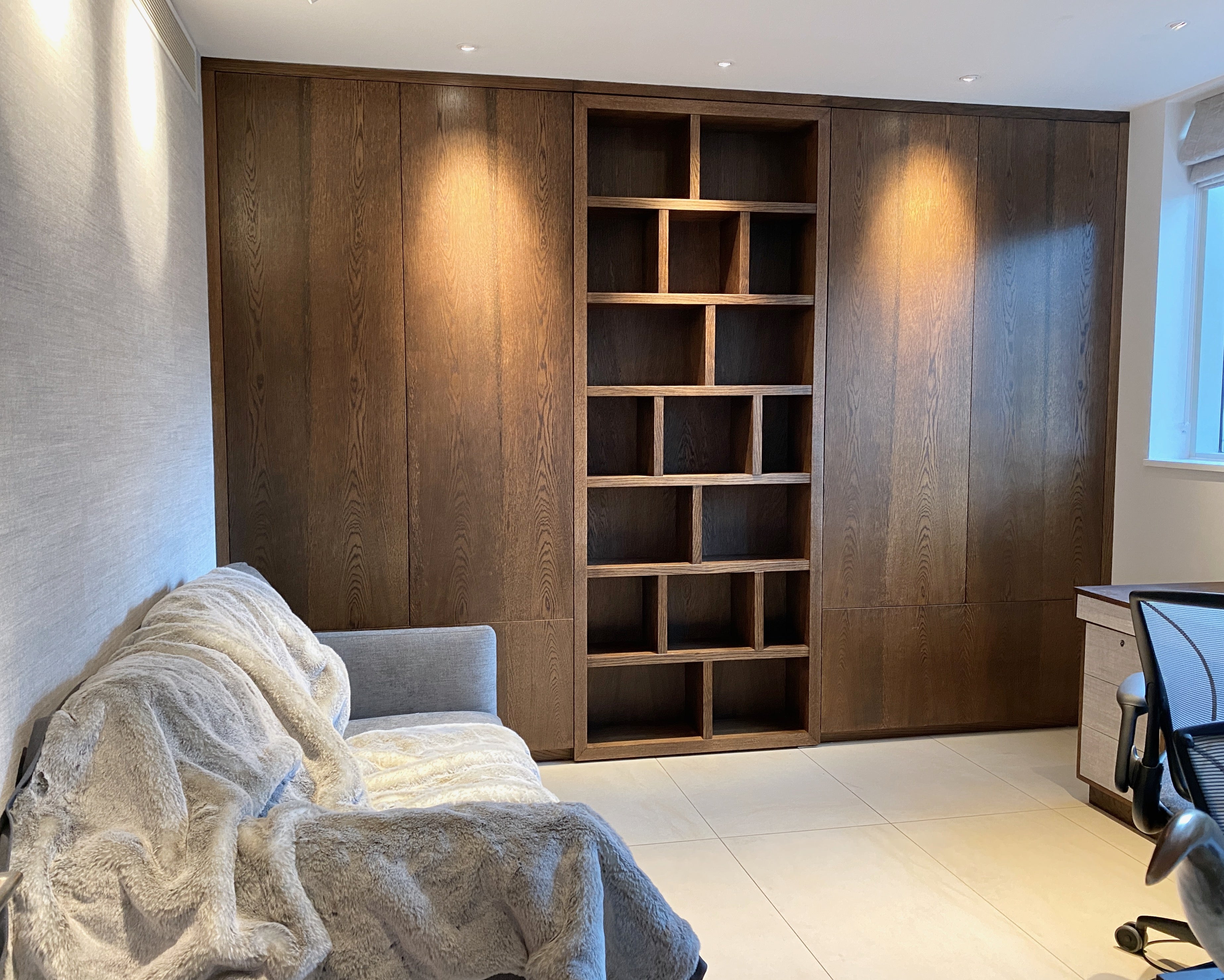
As soon as I saw this wall with two metal cupboards and a metal door in the middle, I knew it needed replacing with a floor to ceiling wall of bespoke joinery. I also knew I wanted to conceal that door...

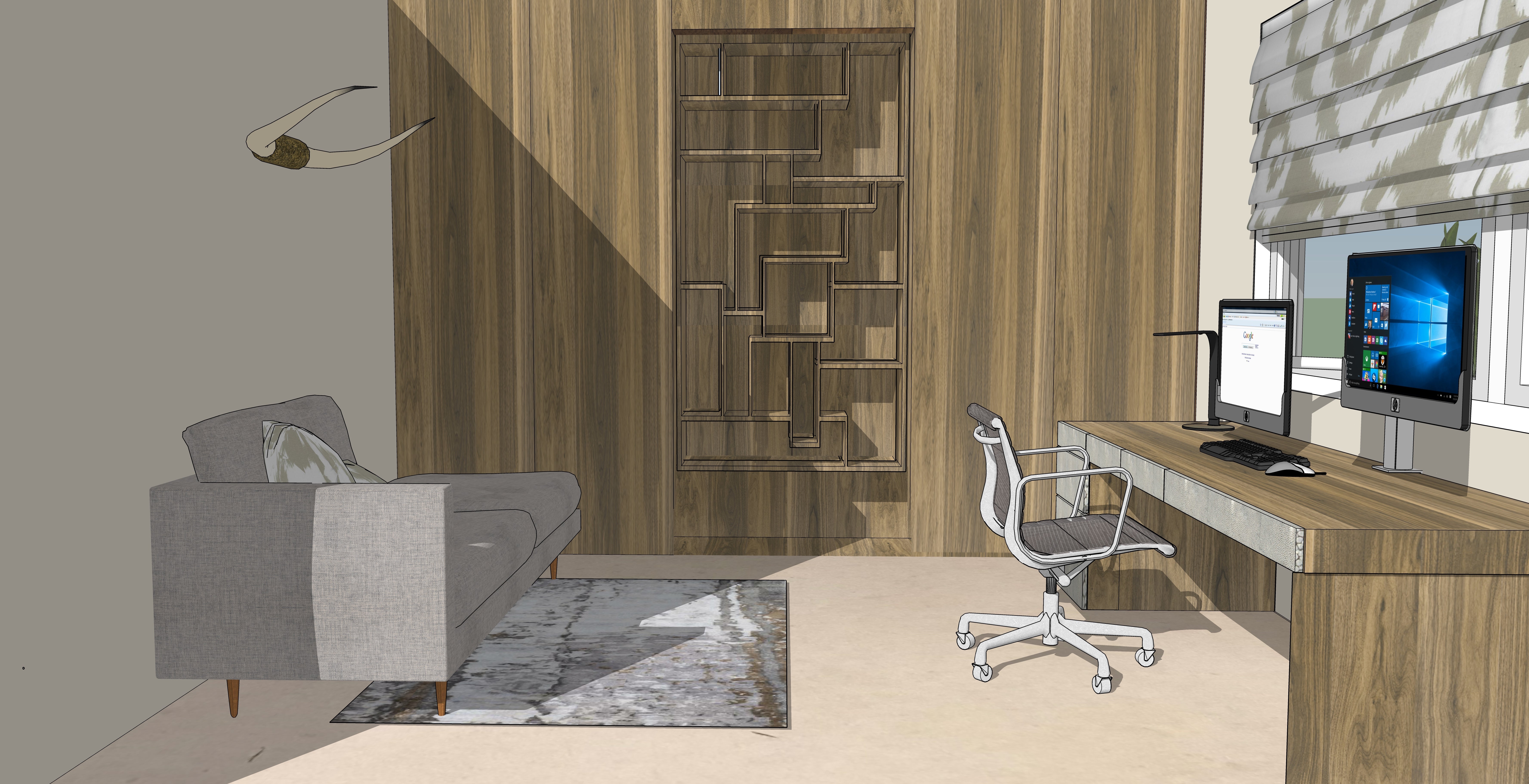
Space Planning & 3D Rendering...
Integral to my design process is the creation of 3D renderings or 3D visuals for my Clients on every project. It's the ultimate tool for gaging how a new design will work in the space. It's invaluable especially when designing fitted furniture since once it's commissioned, there's no going back!

A Secret Bookcase door!
What better way to conceal a door than to put a bookcase right on top of it! By doing this I created not only a continuous wall of walnut beauty but the novel idea of a hidden door delighted both my clients and their kids and became a major talking point for many events they hosted at their house pre March!
On a functional level it was two fold - they had a useable bookcase and just had to pull it towards them to access the Gym!
Moreover given it's a secret door with a lock on the inside, my clients decided they would also use it their safe room / panic room in the event of a break in, which of course we all hope they will never need to, but it great to have!

These brilliant "shelf dividers" on the bookcase are movable for flexible display options! They are just waiting for some beautiful objets to be placed there. The door opens very steadily and smoothly so there is no risk to anything flying off when opening and closing!
They wanted an area in the room where they could sit and relax with their kids while they were working but it also needed to become a guest room for their parents when they came to stay. So after much sourcing, I found a stunning, contemporary sofa bed from Camerich and we had it made up in a smart looking mid grey beige chenille fabric that would not only be in keeping with the new contemporary look of the Home Office but would also be practical at masking any marks two small children might make!
My client fell in love with the stunning Lacuna London Living two tone Luxury Foxy Throw (pictured below) that we layered the sofa bed with. Perfect to sink into and wrap over you on chilly Autumn afternoons!
This space is just WAITING for the horns to be installed , a bright or Bold geometric rug and a side table with warm metal finishes to complete the design like below.
Contrast makes a design sing!
Behind the sofa , I wanted to create a statement wall, something that would add warmth and texture and contrast with the rich walnut cupboards and bookcases to the right. From my discussions with my clients and knowing he wanted to incorporate a bit of his Texan background and they both wanted to have elements of an "American Study" type feel to the room , I knew they would appreciate a fabulous pair of Texas Long Horns hung on the Statement wall above the sofa and this gorgeous Arte wall covering is the perfect back drop for it.


3D rendering of the feature wall and seating design proposal featuring a Caramel Tabac leather sofa for contrast
Photorealistic rendering with a lighter fabric option for the sofa and a luxurious Lacuna London Living beige Lynx throw.
They both had extremely different lighting preferences and needs. He needed it lit up like the Sun with absolutely "no shadows", where as his Wife preferred cosy, warm and subtle lighting to boost relaxation and meditative work instead. You can't underestimate how personal and important lighting is. It changes peoples moods and can turn a drab, cold space into a fabulous and inviting one with just a switch! The solution to their different lighting needs was layering the light with stand alone lamps, spots and directional task lighting and using several circuits. More on that later....


A 3d rendering with the desks design proposal and new roman blind.

Using inspiring materials is an instant way to make a desk more alluring. .To give the space a cohesive feel I designed their bespoke corner desks using the same walnut veneer and textured grey Arte wall covering for the inlay drawer panels.
The corner tower unit conceals all all the cables for a cable free office and a seamless clutter free look! Floating shelves above the desk that mirror the bookcase shelving design complete the look!

Unique Interior Design guides
and the latest bespoke Lacuna London Living products.


